Before I begin, let me tell you how much I love writing.
I love to write my thoughts out, partially because I am not good at conversating.
And partially because I don’t like to get involved socially much. So, this post is about the geeky me trying to analyze my own thoughts.
Here, I have tried to analyze every bits and pieces I have written in my medium blog posts using various
tools and techniques in text analysis - from frequency distribution of words, to using Word2Vec.
So, yeah! The title might seem elusive at first. But, my thoughts and my writings are correlated in more ways than you can ever imagine.
Preparing The Dataset
At first, I had tried the mighty art of doing copy-paste the posts from my medium profile. After few scrolling, my brain started
rejecting my hands. It was not feasible to actually copy and paste every shit I have written.
46 might not be that big of a number but imagine if
I had more than 100 medium posts. I might have ended inside a black hole.
So, I thought of crawling my medium profile using simple python tools like:
Well! This ended up into another, yet awesome, sidekick project called medium-crawler. Feel free to look up the repository and test it out. Don’t forget to star.
In the end, I have accumulated all the blog posts inside a folder as text files, where each file corresponds to single blog post. I will write how I created the crawler in some later posts in near future. For now, you can just use the crawler to extract as per your requirements.
Tools used for the analysis
Here are all the tools I have used in the analysis.
- python3 : Because python2 will be turning into ashes soon
- conda : Because I find it easier to have different virtual environments for my ML projects
- numpy : Because of efficient numerical computations
- matplotlib : Because we humans like visually pleasing contents, don’t we? (Don’t think of porn!!!)
- nltk : Because it’s easy to do some text processing instead of building your own
- gensim : Because of Word2Vec used in this analysis
- scikit-learn : For using PCA[1] and TSNE[2] in the analysis
Word Distribution
Frequency Distribution
This is probably one of the lamest, but powerful, analysis we can even employ. So, it seems my blog is mostly about people and life.
Following are the top 10 words from overall blog posts:
- life
- people
- time
- mind
- world
- love
- thoughts
- feel
- things
Here’s the output from jupyter notebook:
[('life', 206),
 ('time', 143),
 ('number', 142),
 ('people', 132),
 ('mind', 86),
 ('world', 71),
 ('love', 62),
 ('things', 59),
 ('thoughts', 56),
 ('feel', 52)]
It seems most of my thought processes (correlated with blog posts) are about existence, life and people.
Post length
I tokenized each of the documents (from now I will refer to each blog post as document) based on whitespaces and counted the total number
of tokens in each. In the process, I have discarded the word (token) were of unit length.
So, average length of each document is around 567 (566.9056603773585 to be precise) with 52 documents (at the time of analyzing).
Here’s the list for individual document:
[585, 555, 482, 258, 308, 250, 545, 2, 783, 1053, 408, 1113, 619, 902, 756, 959, 796, 1197, 394, 606, 536, 1033, 1403, 677, 523, 681, 38, 148, 475, 246, 169, 524, 453, 518, 431, 6, 394, 919, 1670, 599, 84, 334, 158, 292, 799, 488, 540, 295, 177, 1239, 693, 630, 303]
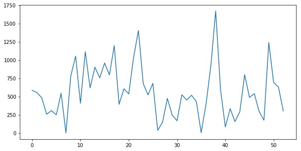
TO-DO: I am lazy enough to not plot this graph as a time-series one that can be based on creation date for each blog post.
Creation Impulse Response
I also tried plotting the time series data based on creation date for each blog post as an impulse response. There seems to be few major
gaps between each year with highest concentration of posts around the dates 2017-04 to 2017-11. Those are the times when I was under
depression due to career, life and existential crisis. So, the posts might be related to such shitty abstractions.
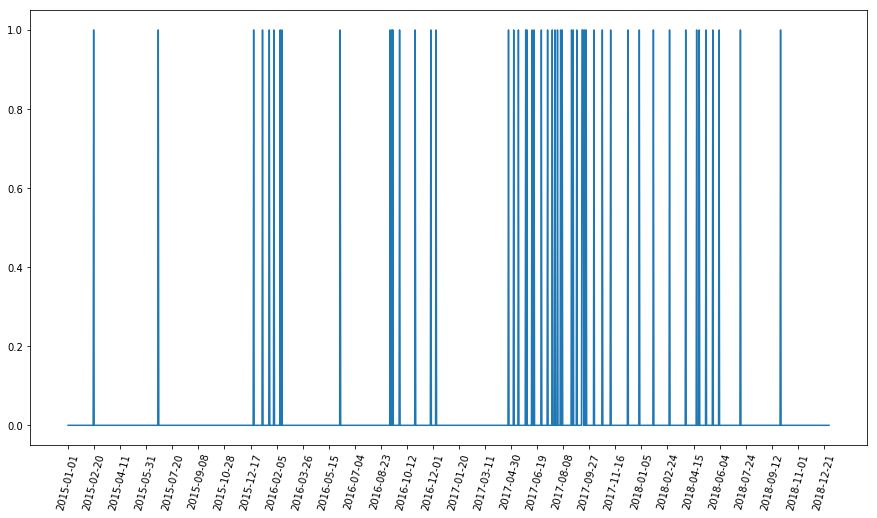
Here, I have rendered manual (and inefficient) time series plot based on the blog posts creation date. For this, initially, I created a certain date range between 2015 and 2019 with increment in days. Then I extracted the creation date from each of the documents and create a impulse-response type of plot by putting 1 where the creation date occured.
Word2Vec Visualization
I trained a word2vec model using all of my blog posts. This gave me a 300-dimension vector representation of each word. Now the problem lies in visualizing each of those vectors. Since, we humans are 3-dimensional being, we cannot comprehend dimensions higher than that. So, I used various projection techniques like PCA, SVD and TSNE.
PCA
Using sklearn’s PCA module imported from sklearn.decomposition, I projected the 300-dimension vector to 2d as:
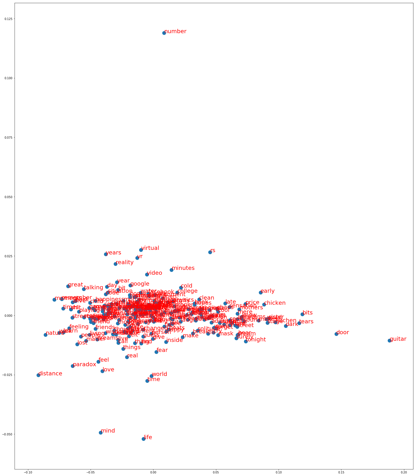
From this projection, we can clearly see that words like mind, life, feel, love, world appear to be nearer in the latent space.
This suggests that my blog posts tend to have these words in similar contexts. As a result, it can be said that my blog posts are
somewhat related to such concepts in the nutshell.
The words like number, guitar seem to be lonely (isolated). It suggests that I don’t use them often.
TSNE
t-SNE is manifolding technique which reduces dimensions non-linearly. The t-SNE algorithm works in a very different way and focuses to preserve
the local distances of the high-dimensional data in some mapping to low-dimensional data. It is non-deterministic in nature which just means
if we run the algorithm several times, it gives us different projections unlike PCA which gives us same projection every time we run.
TSNE can be imported from sklearn as:
from sklearn.manifold import TSNE
Following images are some of the output from t-sne when run multiple times.
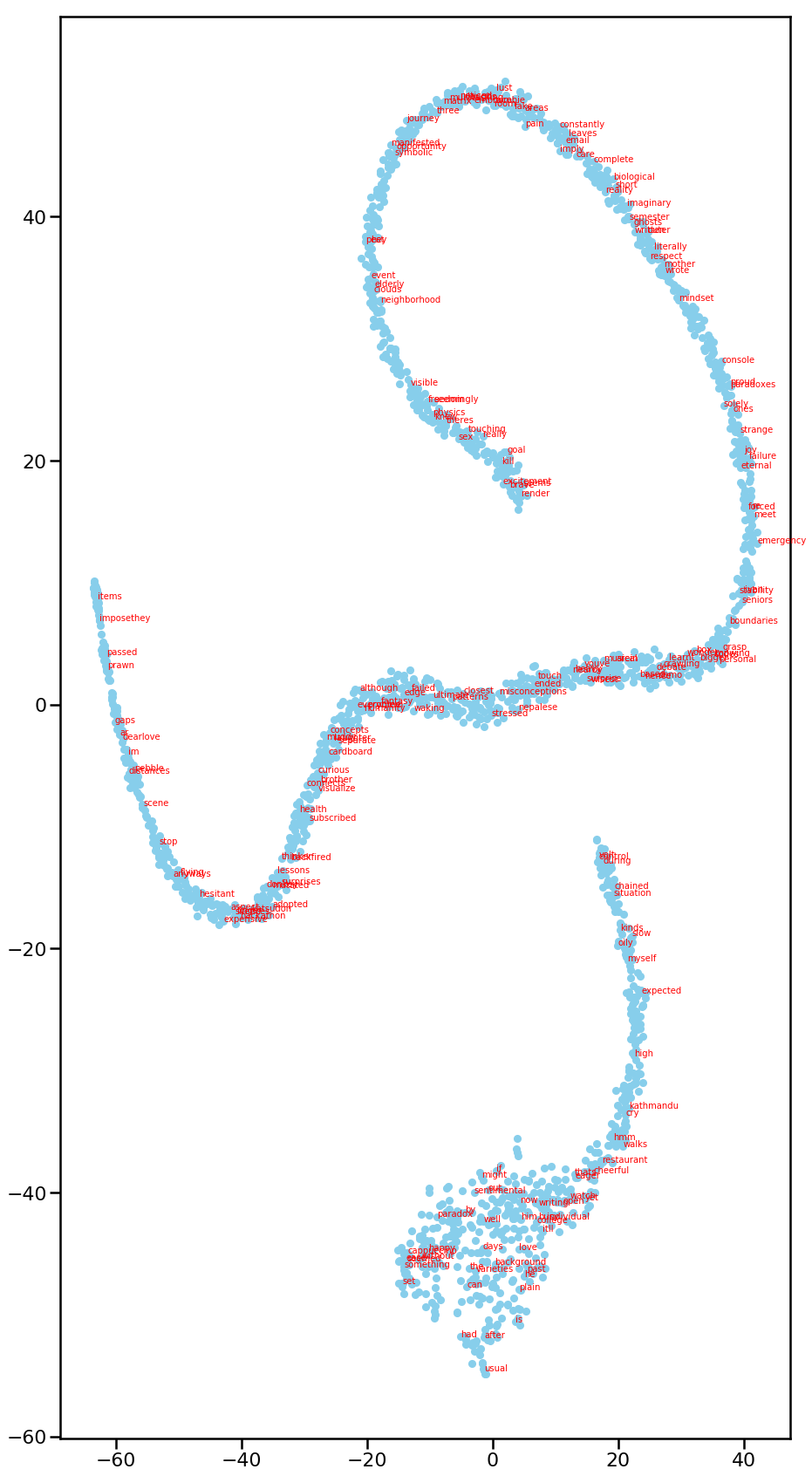
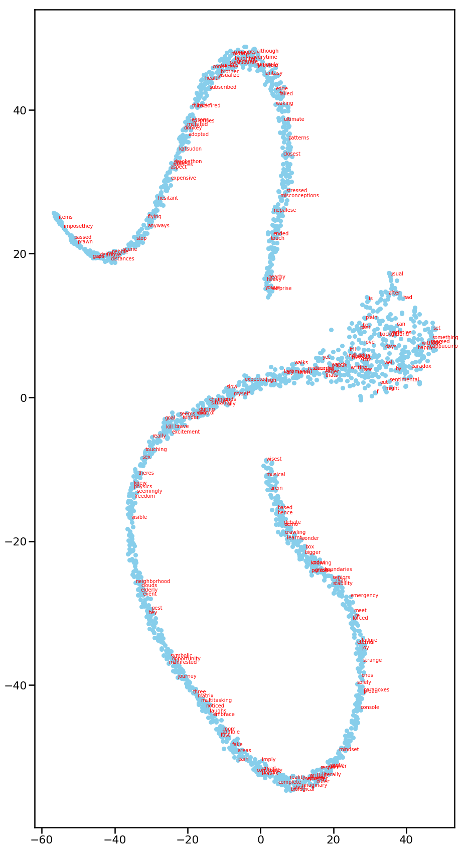
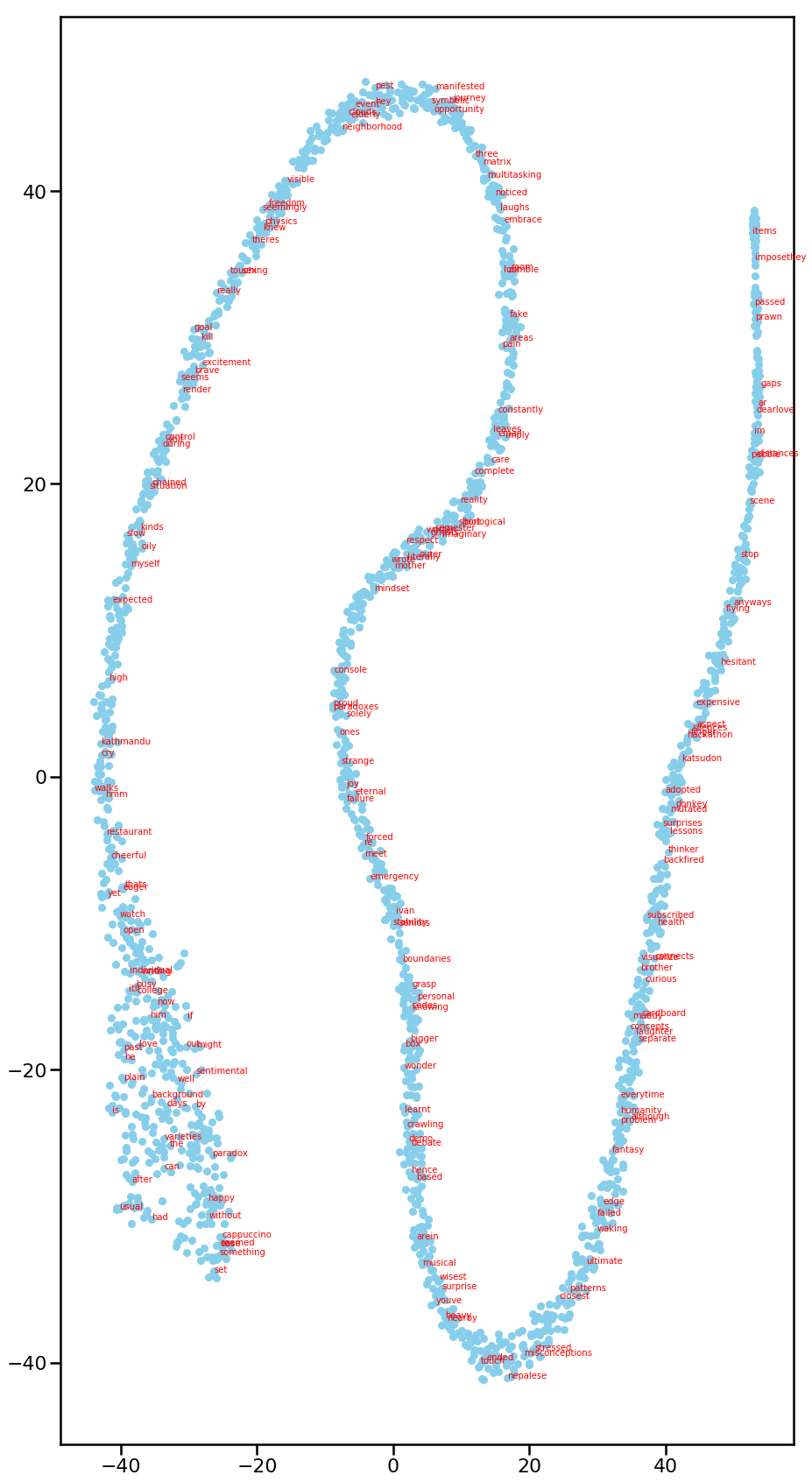
From different iterations, it can be seen that the decomposition is similar in nature - long snake shape. In fact, for first 2 pictures,
there are 2 separate “snakes” that are isolated from each other. My hypothesis is that most words in my blog posts fall in either of those
snakes. Those snakes might represent the contextual awareness of words with each other.
Nevertheless, t-sne is eye-candy for visualization. It gives us general notions of local points and clusters.
Bonus
I have posted the whole code here. You can find 2 jupyter notebooks namely - analyzer
and document-clustering. Feel free to star it if you like the whole idea of analyzing thoughts.
Final Note
The analysis and my observation might be biased because I know what type of blog posts I create. Perhaps, the best way to analyze the thoughts is by making other folks do the observation based on the graphs and some metrics.
References
[1] Principal Component Analysis
[2] t-distributed stochastic neighbor embedding